Jlife (Neshamah)
Process
Overview
Neshamah is a Jewish content app for video, music, learning, and prayer. In 2026 it acquired Jlive, an events and ticketing platform, and set out to merge the two into one app under a new name: Jlife.
The starting plan was a rename. Keep Neshamah's colors and look, change the name, move on. The product team couldn't theme the app until the brand was settled, and the holiday season set a hard deadline.
The tech lead chose to work with us directly, so he could brainstorm with the person doing the work. We were already running Neshamah's social content, so we knew the product and the people.
The Challenge
- The brand had to serve the bigger audience. Jlive's audience was many times larger than Neshamah's. Keeping Neshamah's look would have meant designing for the smaller group in the merger.
- Three brands in play. Neshamah's bloom symbol and dark blues, Jlive's purple palette, and an earlier Jlife concept built from deconstructed Star of David triangles.
- A crowded, heavy category. Most Jewish apps are dense and institutional. Jlife needed to feel like the apps its audience already opens every day.
- A product deadline. Engineers were waiting on colors and type to start theming. The brand had to arrive in a form they could build with.
Our Approach
- A sprint built around the release. Two weeks of working sessions with the tech lead, ending in a walkthrough with the CEO where the final palette was chosen. The clock ran day for day: if a decision or an asset slipped, the end date moved and the scope stayed.
- Research before design. We benchmarked the apps the audience lives in, like Spotify, Instagram, Headspace, Airbnb, and Strava, alongside other Jewish apps. Two findings shaped everything: Jewish apps overload the screen, and warm paper backgrounds are almost unused in the category. That warm background became one of Jlife's signatures. We positioned the brand for adult, cultural Jewish life, between institutional and youth-focused.
- Decisions made in the room. We put mark concepts in front of the tech lead live, from a J monogram and a challah braid to a dot cluster, a mosaic, and layered triangles, and narrowed them together. Directions that didn't work were dropped in the session, and the strongest one was refined between sessions.
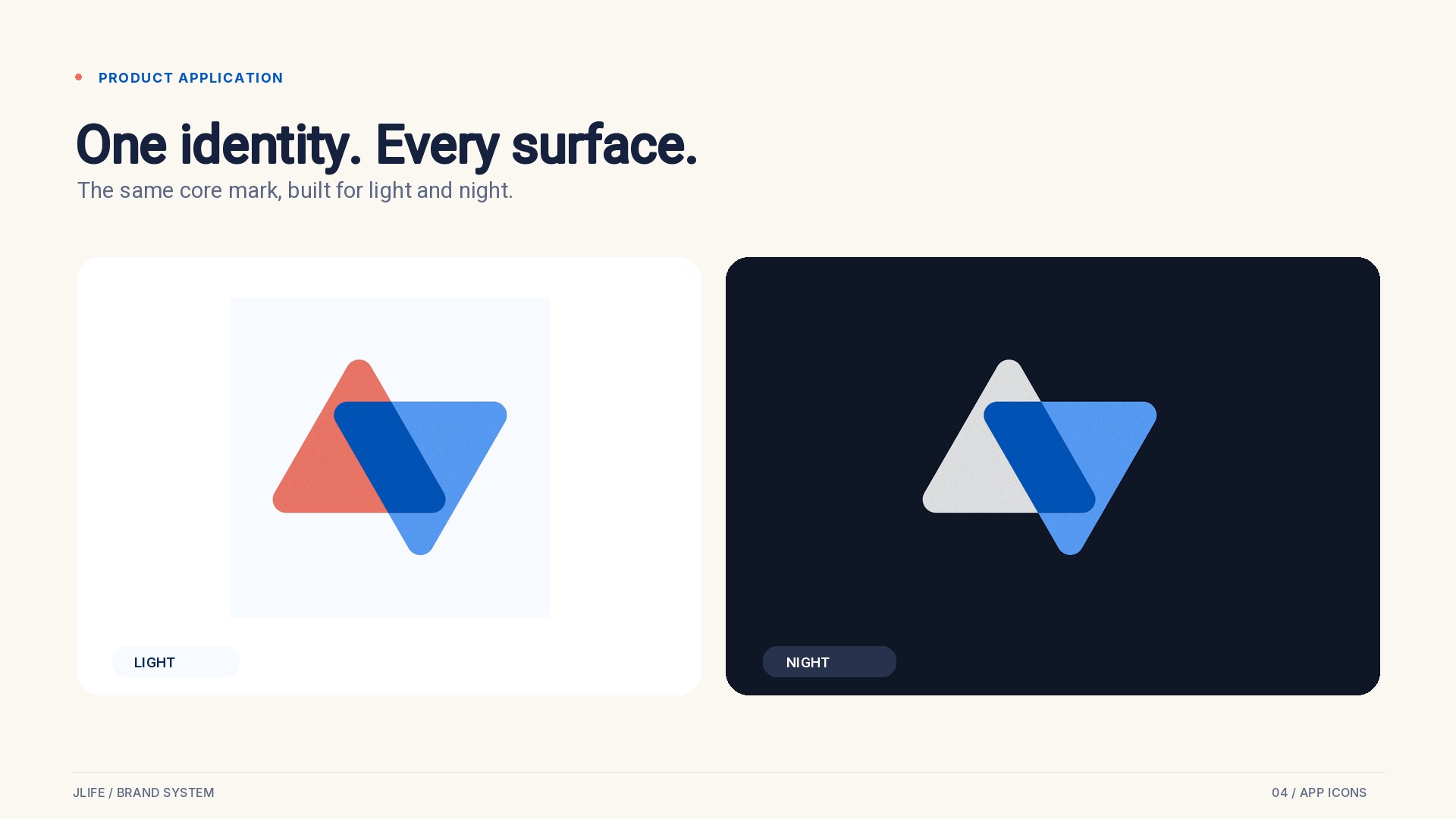
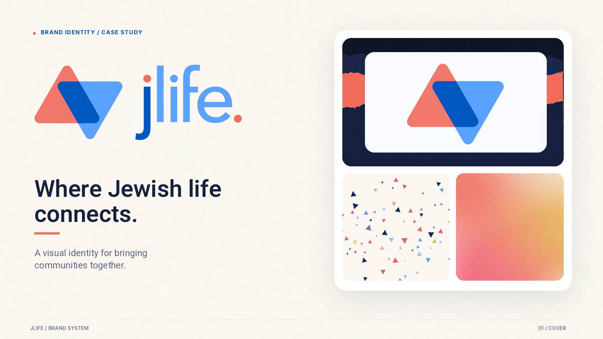
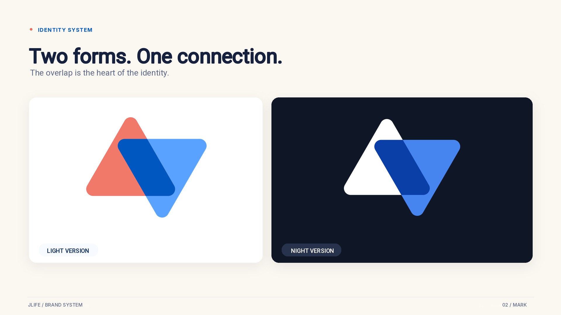
- A mark with a reason. The final mark takes only the two triangles of the Star of David, one reaching up and one reaching down, and holds them at the moment they meet. Coral is the human triangle: warmth and welcome. Blue is heaven reaching back: trust and tradition. The star is implied and never completed, so the person completes it. That idea gave the brand its line: Where Jewish life connects.
- Color chosen with reasons. Blue leads, since Judaism has a natural claim to it, but we stayed clear of flag blue. Terracotta and sand were rejected for reading like a wellness app, and navy-heavy palettes for reading like a bank. Coral carried over from the earlier Jlife concept, and gold came in as an accent for learning and prayer. The palette went lighter and brighter to feel modern, with a night mode for those who want it. Flat colors carry the screens, and gradients stay as accents.
- A wordmark built to be read. A shorter j with its dot keeps the j and l apart, and the period at the end balances the dot and makes a point: Jlife. Period. One place for Jewish life.
- One typeface for two alphabets. Heebo is free and covers Hebrew and English in a full range of weights, so one typeface works across the whole product.
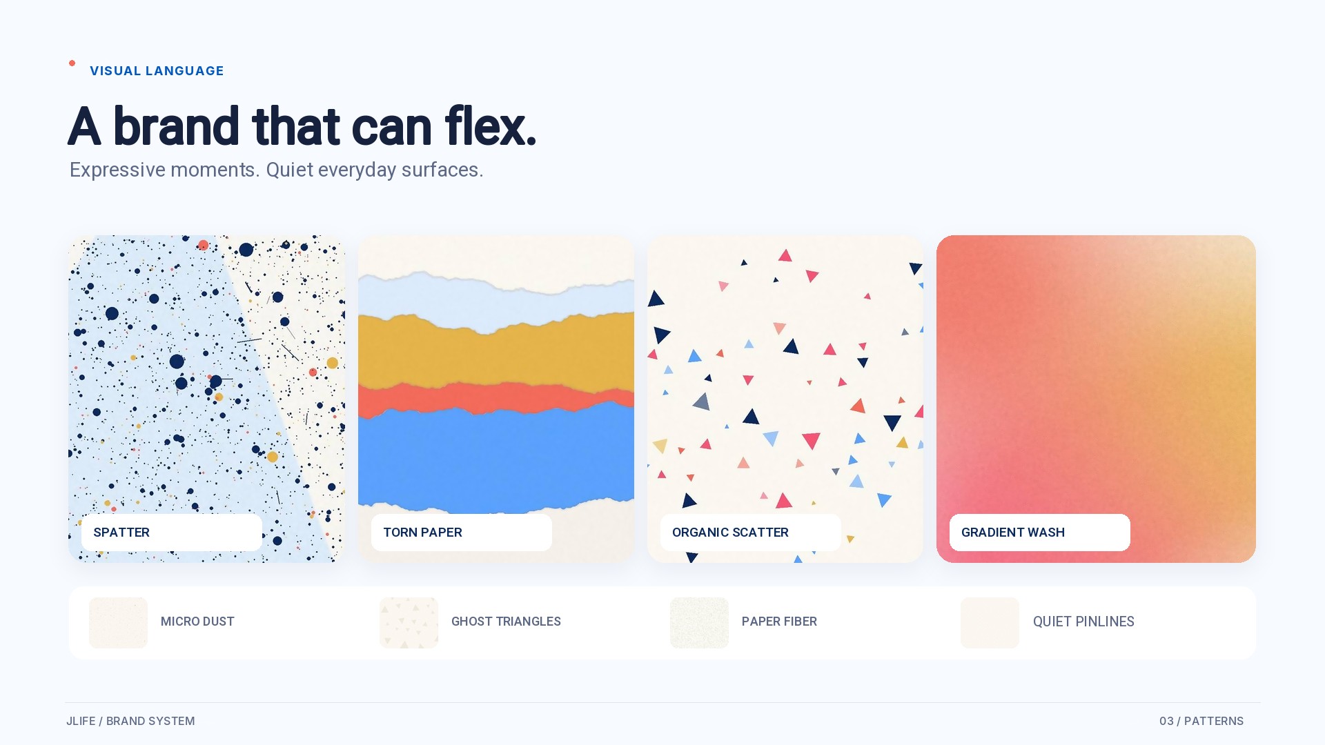
- Rules the product team can apply. Illustrations mark categories and photography and video carry content, so users can tell browsing from watching at a glance. Four expressive patterns handle covers, events, and social. Four quiet textures sit behind copy and interface. Every piece works in light and night.
- Delivered as tokens. Colors, type, and surfaces were handed over as named CSS variables with contrast ratings, so engineers could build straight from them.
- Brand and UX together. Alongside the identity, we fed into the app's structure: separate worlds for content, community, and practice, a simpler home screen built around what each user follows, and a bottom navigation capped at five items.
Results
A complete app brand in two weeks
- Everything an app launch needs. Mark and lockups, wordmark, app icons, a palette in light and night, Heebo for both alphabets, a pattern library, category illustration rules, app direction, and production-ready tokens. Branding agencies typically scope this as a multi-month engagement.
- Built in the product's own materials. The brand arrived as tokens, icons, and rules, so the product team could start painting the app immediately and ship a version that looked and felt like the rebrand within weeks.
- A brand the client owns. The tech lead was in every decision, and the CEO made the final palette call at the walkthrough, so leadership signed off on a direction their own team had shaped.
Now live in the App Store
The merged app has launched publicly. The App Store listing reads JLife - Jewish Life, marked "Formerly Neshamah," with the two-triangle icon and the new palette and type running in the product. The release notes put it simply: "Neshamah is now Jlife! New name, new look, same soul."
Why this works for app teams
- It runs on your release schedule. The brand was built around a launch date and a team waiting to build, and it arrived on time.
- It ships as product. Tokens, icons, both modes, and clear rules for how content and categories look. Engineers get what they need to build without translating a brand book.
- One person, start to finish. The same person researched the category, designed the mark, made the system, and worked on the UX, so nothing was lost between handoffs.
- Every choice has a reason. Each color, letterform, and pattern can be explained to a board, an investor, or a new hire, which makes the brand easier to defend and easier to extend.